Infographer - Ultimate Infographic WordPress Theme
Responsive Infgoraphics/AJAX/Parallax theme
- Created: 06/21/2013
- latest Update: 06/21/2013
- By: Qode Interactive
- Email: support@qodeinteractive.com
Welcome to Infographer - Ultimate Infographic WordPress Theme
Introduction
Installing INFOGRAPHER Theme
You can install this WordPress theme using two installation methods:
- Using WordPress Administration Panel
- Copying theme files via ftp
METHOD 1
Using infographer.zip found in ZIP file you downloaded from ThemeForest.com you should perform the following steps:
- Login to WP admin
- Go to Appearance > Themes option and click on it to load new page
- Select Install Theme tab at the top of the panel to load new page
- Click on Upload option at the top of the panel to load new page
- Click on Browse button and locate infographer.zip on your file system
- Click on Install Now button
- Once installation is complete you can activate Infographer theme
METHOD 2
IMPORTANT NOTE: If you are using FileZilla, make sure to fix it as described below before you copy the files:
http://stackoverflow.com/questions/554960/how-can-i-stop-filezilla-changing-my-linebreaks
Using infographer directory found inside of infographer.zip file located inside ZIP file you downloaded from ThemeForest.com you should perform the following steps:
- Using FTP client you should login to server where your WordPress web site is hosted
- Using FTP client you should navigate to /wp-content/themes/ directory under your WordPress web site’s root directory
- Using FTP client upload infographer directory to themes directory on remote server
- Once installation is complete you can activate Infographer theme
Importing Demo Content
If you would like to learn the best practice of using INFOGRAPHER theme, you can import content from our demo web site. Importing theme is performed using XML file located in theme ZIP file downloaded from ThemeForest and following these steps:
- Open WP Admin Panel
- Click on Tools > Import from left menu
- Click on WordPress item in the list of importers
- If the plug-in is not installed, click on Install Now button
- Select XML file provided with our theme and upload it. It will take couple of minutes to install our theme (If your server is not able to upload the demo files with attachments, you should import it without attachments)
- Click on Appearance > Menus from left menu
- Chose “Main menu” in Top Navigation combo box
Importing Revolution Slider Home Page Demo
You can import Revolution Slider from our demo web site using files located in xml export > revslider folder of ZIP file downloaded from ThemeForest. Please, follow these steps:
- Click on Revolution Slider from left menu
- Click Create New Slider
- Enter slider Title, enter "home" in Slider Alias and save slider
- Click on Show Export / Import at the bottom of the form and upload home.txt
- Copy captions.css to wp-content > plugins > revslider > rs-plugin > css
You can repeat steps 1-4 for other sliders. You should name slider same as txt file (for example when importing about.txt name of the slider should be about)
Upgrading INFOGRAPHER Theme
IMPORTANT NOTE: If you are using FileZilla, make sure to fix it as described below before you copy the files:
http://stackoverflow.com/questions/554960/how-can-i-stop-filezilla-changing-my-linebreaks
You can upgrade our theme by performing following steps:
- Download latest theme zip file from ThemeForest
- Extract it and locate infographer.zip
- Extract infographer.zip and locate infographer folder
- Copy/Replace the content of infographer folder to /wp-content/themes/infographer folder of your web site.
Feel free to ask us any question about using features INFOGRAPHER theme offers.
Theme Options
Access the “Qode” General options in the left menu, below Tools and Settings. Set general theme appearance in Qode general options. Some of these options may be overridden locally, in the shortcode or page settings (e.g. text color in editor or slider settings in slider tab when creating a page).
Most options in these tabs are self-explanatory. Explanations for options that need further clarification will be provided here.
GLOBAL OPTIONS
Colors
The elements of INFOGRAPHER theme are made up from two primary colors which can be accessed in this tab. Also, you can edit following colors: Background color, Box background color, Highlight color, Selection color
Page transition
Choose between predefined AJAX animations between pages. This scenario will be applied to all pages. Eventually it is possible to change the animation style for each page individually (options below text editor when editing pages/posts). Please note that you can turn off AJAX for certain pages there. That might be important for some other plugins to work properly.
Parallax speed
Change the speed of parallax scrolling. Higher value will increase the speed of scrolling. Default speed is 1. Zero will result in a not-moving background.
Custom CSS and Custom JS
Advanced users can add their own code here.
Meta Keywords
Add relevant keywords separated with commas to improve SEO.
Meta description
Enter a short description of the website for SEO.
HEADER AND FOOTER
Hide Header
This option is useful if you plan to build one page web site using Content Menu
1st Level Menu Line Height
This option is important for defining the height of whole header including the logo
Logo
Add website logo here. Adjust the position of logo by entering values in pixels (e.g. Top: 20, Left: 15).
Show hader widget area
This option will showheader widget area
Show footer top/bottom
This option will show top and/or bottom footer widget area
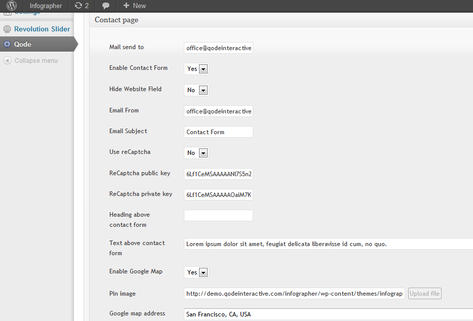
CONTACT
Here is example how contact form should be configured:
Widgets
Infographer Theme comes with following custom widgets:
- Header Right - here you can add anything to the right side of header next to the menu
- Footer Column 1, Footer Column 2, Footer Column 3, Footer Column 4 - here you can add content to footer columns (1-4)
- Footer Text - here you can add for example copyright
You can see example of widgets configurion from our demo web site here:
Shortcodes
Pages/Posts are built using shortcodes accessed by clicking “Qode shortcodes” icon in the top right of the TinyMCE editor. All shortcodes are in the drop down menu listed alphabetically.
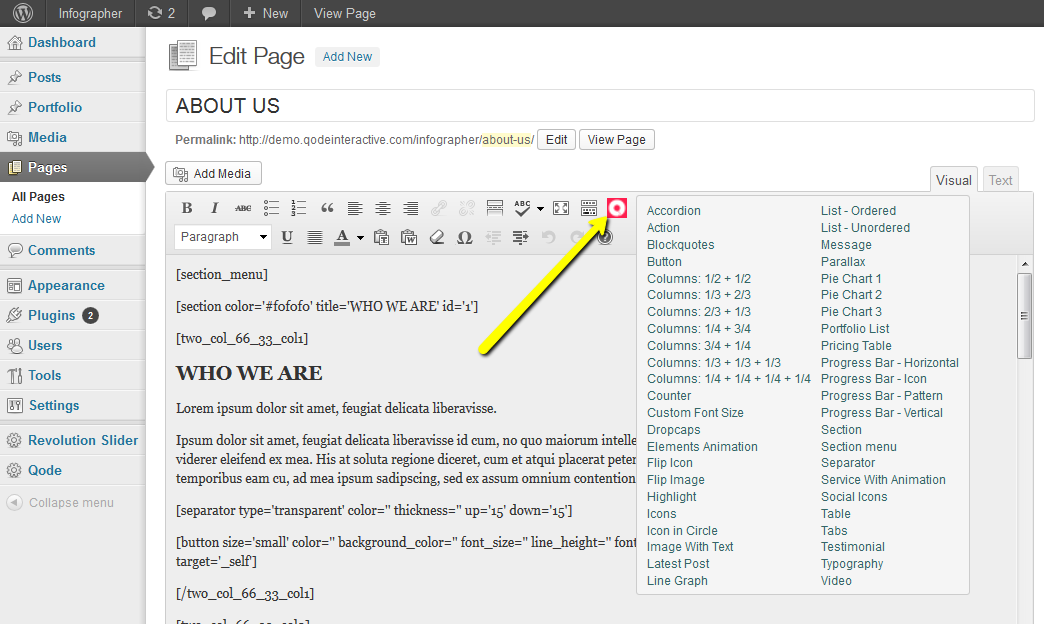
Simpler shortcodes will appear directly in the editor once clicked. More complex shortcodes will display a pop-up window with additional options, different for each shortcode. Change attributes to customize the shortcode before submitting.
IMPORTANT NOTE: If you leave a field empty, the default option will be used.
If shortcodes are customized without pop-up (directly in the editor) change or add attributes between the apostrophes ‘’ (example: message border='yes' or message border='no').
Click on List of Shortcodes menu option or refer to the Shortcodes.txt file included in the theme package to see all attributes for all shortcodes.
Revolution Slider
In order to add Revolution Slider to any page/post in full width, you should enter its shortcode in "Enter revolution slider shortcode" field located inside of Qode Custom Fields section below text editor (when editing page/post).
You can also add its shortcode to text editor at any position if you don't want full width.
Parallax
Infographer Theme has unique way of managing parallax directly while editing posts/pages. You can find custom Qode Parallax section under the text editor.
Add parallax section within any page to create parallax effect. Combine multiple parallax sections to create a full parallax page.
Step 1. Insert a parallax section into a page by adding the shortcode from the dropdown menu. Enter the height of the section between apostrophes ‘’ (example: [parallax_section id='1' height='800']. If left empty, default height of 200px will be used. Also, choose if you want to display back button at the bottom of parallax.
Step 2. Add a new parallax section in the “Qode Parallax” below the editor and “Qode Sliders”. Note that like with sliders, the Unique ID must be exactly the same value as in the shortcode (example: [parallax_section id='1']. Images must be higher than parallax section height in order to avoid blank space between sections.
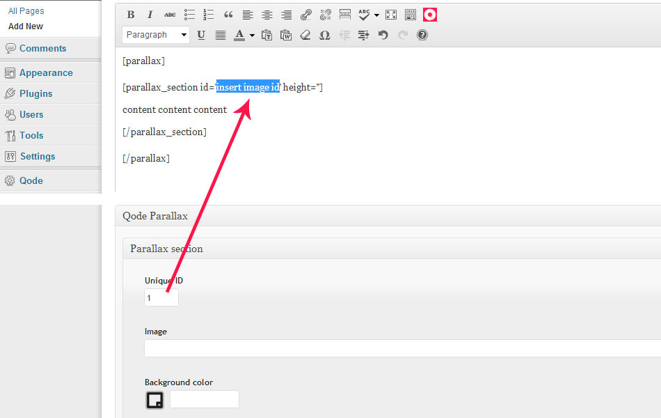
Step 3. Add text, images or any other shortcode (columns, tabs, accordions, messages etc) in the editor within the parallax section shortcode to customize it.
* You can adjust the speed of parallax effect in the General Options.
Blog
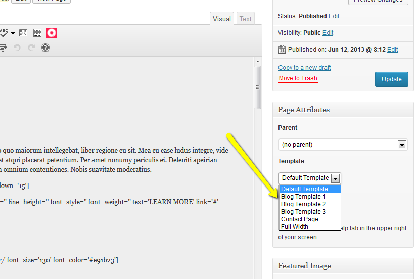
In order to create a blog page, first create a new page and select one of 3 Blog Templates in the right “Page Attributes” menu.
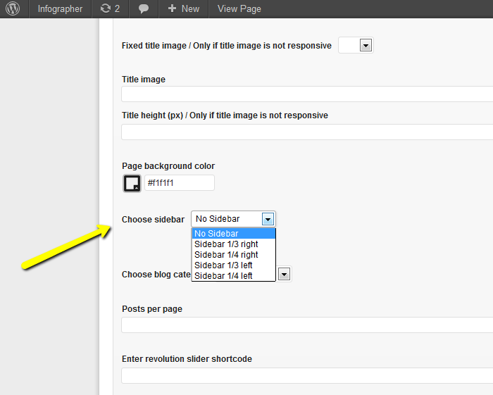
If desired, one of four sidebars can be turned on in the options below editor in Qode Custom Fields section.
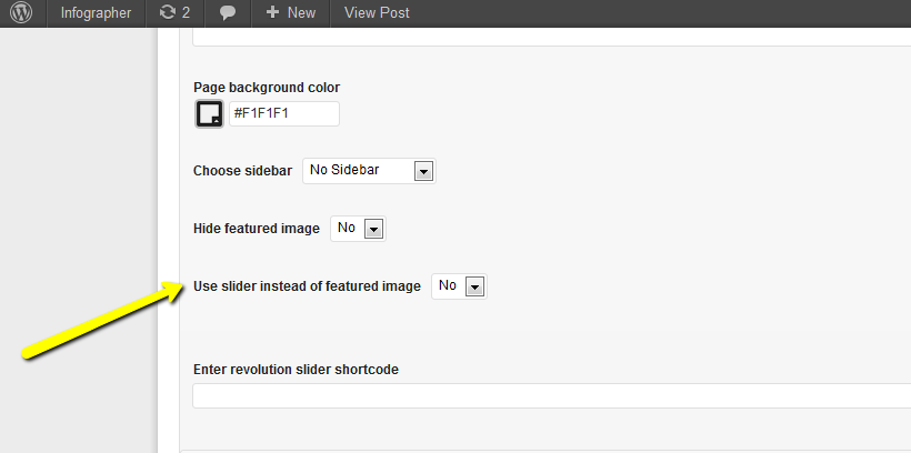
INFOGRAPHER theme blog uses featured images as primary images for posts displayed on the blog list. Featured images are also used as first images in every post by default. Optionally for each post, a slider can be used instead of the featured image in the options below editor “Use slider instead of featured image”.
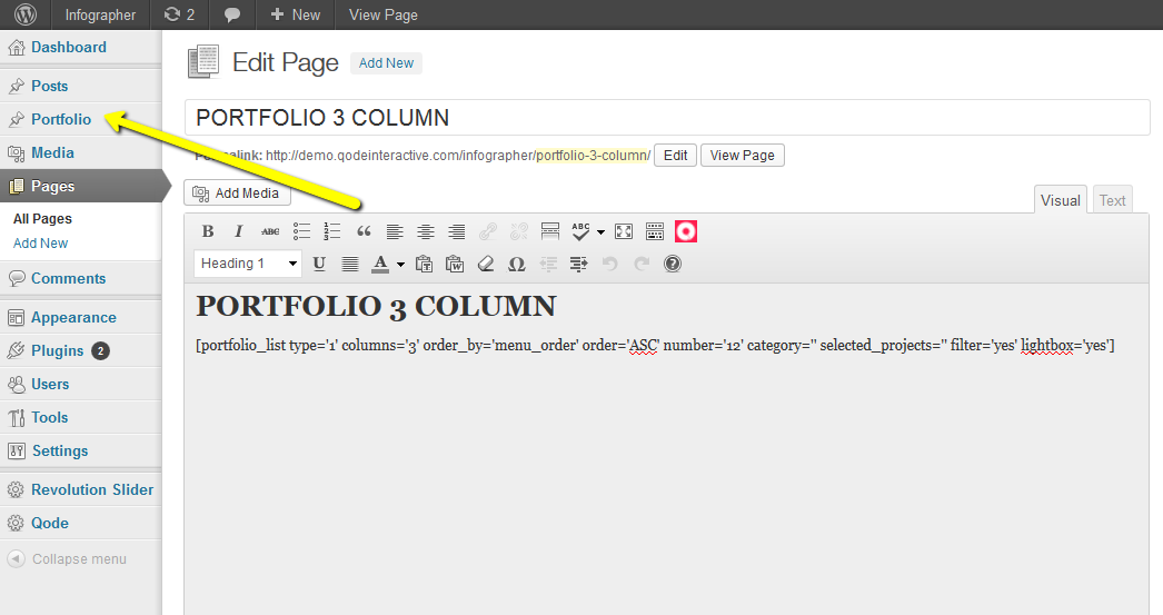
Portfolio
See the new Portfolio post type in the left WordPress menu. In order to create a portfolio page, create a new page and enter the Portfolio List shortcode from the Q dropdown menu in editor (e.g. [portfolio_list type='1' columns='3' order_by='menu_order' order='ASC' number='12' category='' selected_projects='' filter='yes' lightbox='yes']). This will generate a portfolio list page which will be empty if there are no Portfolio projects added.
Portfolio shortcode allows listing only posts from certain category. You should add "slug" of chosen category when placing shortcode to page. This is very useful if you want to create different pages for different categories.
Also, portfolio shortcode is updated to render sub-categories in filter. It will render only one level of children.
Adding Portfolio items is the same as creating blog posts. Portfolio images are added through “Portfolio Images” link below editor. Create custom label name (e.g. Project URL) through the “Option Items”.
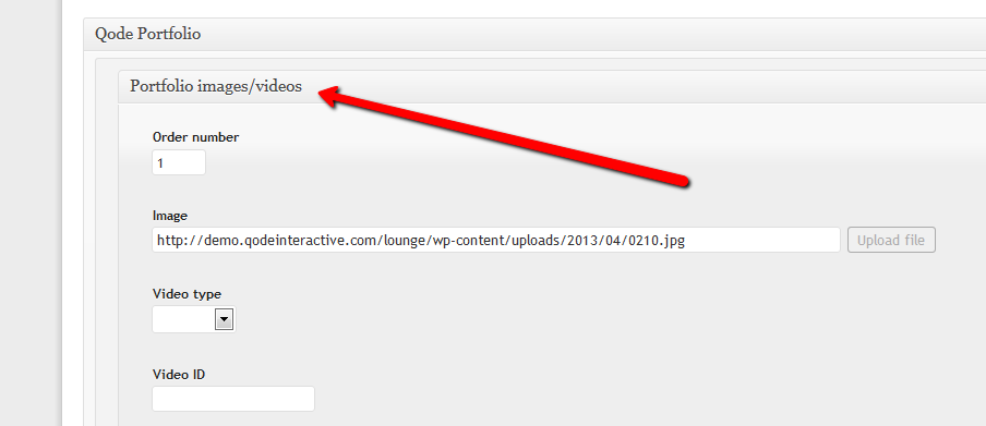
Also our theme allows adding videos together with images. Please not that when adding new Portfolio image/video item, if you want video to display, you should leave image field empty. Also, in the Video field, you should just enter ID, based on Video type chosen (Vimeo or Youtube).
List of Shortcodes
This is a list of all shortcodes available in this theme. Please note that some shortcodes have additional attributes (options) in pop-up window once selected in the dropdown menu.
ACCORDION
ACTION
BLOCKQUOTES
BUTTON
COLUMNS 1/2 + 1/2
COLUMNS 1/3 + 2/3
COLUMNS 2/3 + 1/3
COLUMNS 1/4 + 3/4
COLUMNS 3/4 + 1/4
COLUMNS 1/3 + 1/3 + 1/3
COLUMNS 1/4 + 1/4 + 1/4 + 1/4
COUNTER
CUSTOM FONT SIZE
DROPCAPS
ELEMENTS ANIMATION
FLIP ICON
FLIP IMAGE
HIGHLIGHT
ICONS
ICON IN CIRCLE
IMAGE WITH TEXT
LATEST POST
LINE GRAPH
LIST - ORDERED
LIST - UNORDERED
MESSAGE
PARALLAX
PIE CHART 1
PIE CHART 2
PIE CHART 3
PORTFOLIO LIST
PRICING TABLE
PROGRESS BAR - HORIZONTAL
PROGRESS BAR - ICON
PROGRESS BAR - PATTERN
PROGRESS BAR - VERTICAL
SECTION
SECTION MENU
SEPARATOR
SERVICE WITH ANIMATION
SOCIAL ICONS
TABLE
TABS
TESTIMONIAL
TYPOGRAPHY
VIDEO
ACCORDION
- TYPE: Accordion and Toogle
- Arrow Style: White Arrow and Black Arrow
- Title Color
- Background Color
[accordion accordion_type='accordion']
[accordion_item caption="Accordion 1" title_color='' background_color='' arrow_style='white_arrow']
This is some content
[/accordion_item]
[accordion_item caption="Accordion 2" title_color='' background_color='' arrow_style='white_arrow']
This is some content
[/accordion_item]
[accordion_item caption="Accordion 3" title_color='' background_color='' arrow_style='white_arrow']
This is some content
[/accordion_item]
[/accordion]
ACTION
- Background Color
[action background_color='']
Put here some content
[/action]
BLOCKQUOTES
- Text
- Width (%)
[blockquote width='']
Dummy Blockquote text
[/blockquote]
BUTTON
- Size: Tiny, Small, Medium and Large
- Text
- Link
- Target: Blank, Self, Parent and Top
- Color
- Background Color
- Font Style: Normal and Italic
- Font Size
- Line Height
- Font Weight: 200, 300, 400, 500, 600, 700, 800 and 900
[button size='tiny' color='' background_color='' font_size='' line_height='' font_style='' font_weight='' text='' link='' target='']
COLUMNS 1/2 + 1/2
[two_col_50_50_col1]
content content content
[/two_col_50_50_col1]
[two_col_50_50_col2]
content content content
[/two_col_50_50_col2]
COLUMNS 1/3 + 2/3
[two_col_33_66_col1]
content content content
[/two_col_33_66_col1]
[two_col_33_66_col2]
content content content
[/two_col_33_66_col2]
COLUMNS 2/3 + 1/3
[two_col_66_33_col1]
content content content
[/two_col_66_33_col1]
[two_col_66_33_col2]
content content content
[/two_col_66_33_col2]
COLUMNS 1/4 + 3/4
[two_col_25_75_col1]
content content content
[/two_col_25_75_col1]
[two_col_25_75_col2]
content content content
[/two_col_25_75_col2]
COLUMNS 3/4 + 1/4
[two_col_75_25_col1]
content content content
[/two_col_75_25_col1]
[two_col_75_25_col2]
content content content
[/two_col_75_25_col2]
COLUMNS 1/3 + 1/3 + 1/3
[three_col_col1]
content content content
[/three_col_col1]
[three_col_col2]
content content content
[/three_col_col2]
[three_col_col3]
content content content
[/three_col_col3]
COLUMNS 1/4 + 1/4 + 1/4 + 1/4
[four_col_col1]
content content content
[/four_col_col1]
[four_col_col2]
content content content
[/four_col_col2]
[four_col_col3]
content content content
[/four_col_col3]
[four_col_col4]
content content content
[/four_col_col4]
COUNTER
- Type: Zero Counter and Random Counter
- Position: Left, Right and Center
- Delay (ms)
- Digit
- Font Size
- Font Color
[counter type='type1' position='left' delay='' digit='' font_size='' font_color='']
Title
Content content content
[/counter]
CUSTOM FONT SIZE
- Content
- Font Size
- Line Height
- Font Family
[custom_font_size content='Put here some text' font_size='' line_height='' font_family='']
DROPCAPS
- Letter
- Dropcap Style: Normal and With Underline
- Background Color
- Underline height
- Underline Color
[dropcaps style='' background_color='' underline_height='' underline_color='']A[/dropcaps]
ELEMENTS ANIMATION
- Animation Type: Elements Shows From Left Side, Elements Shows From Right Side, Elements Shows From Bottom Side, Elements Shows From Top Side and Elements Show From Fade
- Delay (ms)
[elements_animation animation_type='element_from_left' delay='']
Put here some content
[/elements_animation]
FLIP ICON
- Position: Left and Center
- Icon Type: White, Red and Black
- Icon List: 75 Icons
- Front Background Color
- Back Background Color
- Flip Item on Appear: No / Yes
[flip_icon position='left' type='white' icon='airplane' front_color='' back_color='' flip_on_appear='']
Title
[/flip_icon]
FLIP IMAGE
-Flip Image Animation: Flip and Fade
- Flip Item on Appear: No / Yes
- Delay for Flip Item on Appear (ms)
[flip_image animate='flip' delay='' flip_on_appear='' front_image_link='' back_image_link='' back_text='']
HIGHLIGHT
[highlight] content content content[/highlight]
ICONS
- Icon Type: White, Red and Black
- Icon List: 75 Icons
[icon type='white' icon='airplane']
ICON IN CIRCLE
- Icon Type: White, Red and Black
- Icon List: 75 Icons
- Circle Color
- Circle Position: Left and Center
[icon_in_circle type='white' icon='airplane' circle_color='' position='']
Title
Put here some content
[/icon_in_circle]
IMAGE WITH TEXT
- Image Link
[image_with_text image_link='']
Title
Put here some content
[/image_with_text]
LATEST POST
- Type: Small and Large
- Number of Posts: 2, 3 and 4
- Text Length
[latest_post type='' post_number='2' text_length=''/]
LINE GRAPH
- Type: Rounded Edges and Sharp Edges
- Width
- Height
- Custom Color
- Scale Steps
- Scale Step Width
[line_graph custom_color='' type='' labels='Label 1, Label 2, Label 3']#eeeeee,Legend One,100,78,56;#333333,Legend Two,50,30,88[/line_graph]
LIST - ORDERED
[ordered_list]
1. Lorem Ipsum
2. Lorem Ipsum
3. Lorem Ipsum
[/ordered_list]
LIST - UNORDERED
- Style: Number and Icon
- List Animation: No / Yes
- Number Color
- Icon Color: White, Red and Black
- Icon: 75 Icons
[unordered_list animation='no_animation']
[unordered_list_item style='element_number' title='Lorem Ispun' number='' number_color='' icon='' icon_color='']
Content content content
[/unordered_list_item]
[unordered_list_item style='element_number' title='Lorem Ispun' number='' number_color='' icon='' icon_color='']
Content content content
[/unordered_list_item]
[/unordered_list]
MESSAGE
- Background Color
[message background_color='']
Message Title
Put here some content
[/message]
PARALLAX
- ID
- Height
[parallax]
[parallax_section id='insert image id' height='']
Put here some content
[/parallax_section]
[/parallax]
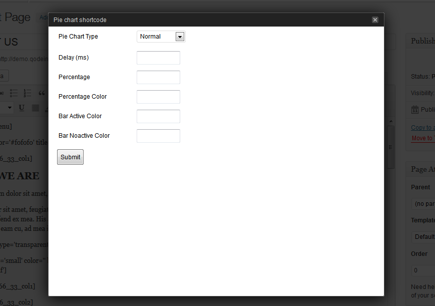
PIE CHART 1
- Pie Chart Type: Normal and Transparent
- Title
- Delay (ms)
- Percentage
- Percentage Color
- Bar Active Color
- Bar Noactive Color
[pie_chart type='normal' delay='' title='Pie Chart Title' percent='' percentage_color='' active_color='' noactive_color=''] This is some content [/pie_chart]
PIE CHART 2
- Width
- Height
- Legend Text Color
[pie_chart2 width='' height='' color='']30,#eeeeee,Legend One;70,#333333,Legend Two [/pie_chart2]
PIE CHART 3
- Width
- Height
- Legend Text Color
[pie_chart3 width='' height='' color='']30,#eeeeee,Legend One;70,#333333,Legend Two [/pie_chart3]
PORTFOLIO LIST
- Type: Type 1 and Type 2
- Filter: No / Yes
- Lightbox: No / Yes
- Columns: 2, 3, 4 and 6
- Order By: Order, Title and Date
- Order: ASC and DESC
- Number of Portfolios on Page
- Category Slug
- Selected Project
[portfolio_list type='' columns='' order_by='menu_order' order='ASC' number='' category='' selected_projects='' filter='' lightbox='']
PRICING TABLE
- Type: Light and Dark
- Title
- Price
- Price Currency
- Price Period
- Link
- Button Text
- Active
- Active Text
[pricing_table type='light']
[pricing_column title='Price dummy title' price='100' price_currency='$' price_period='mo' link='insert your link here' button_text='PURCHASE NOW' active='no' active_text='Best Buy']
[pricing_cell] content content content [/pricing_cell]
[pricing_cell] content content content [/pricing_cell]
[pricing_cell] content content content [/pricing_cell]
[/pricing_column]
[/pricing_table]
PROGRESS BAR - HORIZONTAL
- Type: Normal and Gradient
- Color
- Background Color
- Top Gradient
- Bottom Gradient
- Percentage
- Title
[progress_bars type='normal']
[progress_bar title="Progress 1" percent="50" color='' background_color='' top_gradient='' bottom_gradient='']
[progress_bar title="Progress 2" percent="50" color='' background_color='' top_gradient='' bottom_gradient='']
[progress_bar title="Progress 3" percent="50" color='' background_color='' top_gradient='' bottom_gradient='']
[/progress_bars]
PROGRESS BAR - ICON
- Progress Bar Noactive Icon Color: White, Black, Red and Grey
- Progress Bar Active Icon Color: White, Black, Red and Grey
- Number of Icons
- Number of Active Icons
- Icon List: 75 Icons
[progress_bar_icon noactive='white' active='white' icons_number='' active_number='' icon='airplane']
PROGRESS BAR - PATTERN
- Border Width
- Border Color
- Percentage
- Percentage Color
- Title
- Text Color
[progress_bars_pattern]
[progress_bar_pattern title="Progress 1" percent="50" border_width='' border_color='' percentage_color='' text_color='']
Put here some content
[/progress_bar_pattern]
[progress_bar_pattern title="Progress 2" percent="50" border_width='' border_color='' percentage_color='' text_color='']
Put here some content
[/progress_bar_pattern]
[progress_bar_pattern title="Progress 3" percent="50" border_width='' border_color='' percentage_color='' text_color='']
Put here some content
[/progress_bar_pattern]
[/progress_bars_pattern]
PROGRESS BAR - VERTICAL
- Background Color
- Percentage
- Percentage Color
- Title
- Text Color
[progress_bars_vertical]
[progress_bar_vertical title="Progress 1" percent="50" background_color='' percentage_color='' text_color='']
Put here some content
[/progress_bar_vertical]
[progress_bar_vertical title="Progress 2" percent="50" background_color='' percentage_color='' text_color='']
Put here some content
[/progress_bar_vertical]
[progress_bar_vertical title="Progress 3" percent="50" background_color='' percentage_color='' text_color='']
Put here some content
[/progress_bar_vertical]
[/progress_bars_vertical]
SECTION
- Color
- Title
- ID
- Full Width Section: No / Yes
[section color='' title='' id='' full_width='']
[/section]
SECTION MENU
- Background Color
[section_menu background_color='']
SEPARATOR
- Type: Normal, Transparent and Pattern
- Normal Separator Full Width: No / Yes
- Pattern Separator Full Width: No / Yes
- Color
- Thickness
- Top Margin
- Bottom Margin
[separator type='normal' normal_full_width='' pattern_full_width='' color='' thickness='' up='' down='']
SERVICE WITH ANIMATION
- Services Type: Text and Icon
- Position: Left and Center
- Background Color
- Link
- Target: Self and Blank
- Text
- Icon Color: White, Red and Black
- Icon List: 75 Icons
- Animation In: Fade, Shake, From Top, From Bottom, From Left, From Right, From Top Left, From Top Right, From Bottom Left, From Bottom Right
- Hover Animation: Shake, 360 Rotate, 180 Rotate, Scale 1.5x, Go to Top, Go to Bottom, Go to Left, Go to Right
- Delay (ms)
[service type='text' position='left' background_color='' link='' target='' text='' icon_color='' icon='' animation_in='' hover='' delay='']
SOCIAL ICONS
- Style: White and Black
[social_icons style=''] youtube,http://www.youtube.com, vimeo,http://www.vimeo.com, facebook,http://www.facebook.com [/social_icons]
TABLE
[table]
[table_row][table_cell_head] Dummy Title [/table_cell_head][table_cell_head] Dummy Title [/table_cell_head][table_cell_head] Dummy Title [/table_cell_head][/table_row]
[table_row][table_cell_body] content content [/table_cell_body][table_cell_body] content content [/table_cell_body][table_cell_body] content content [/table_cell_body][/table_row]
[table_row][table_cell_body] content content [/table_cell_body][table_cell_body] content content [/table_cell_body][table_cell_body] content content [/table_cell_body][/table_row]
[/table]
TABS
[tabs tab1="Tab 1" tab2="Tab 2" tab3="Tab 3"]
[tab id=1]
Tab Title 1
Tab content 1
[/tab]
[tab id=2]
Tab Title 2
Tab content 2
[/tab]
[tab id=3]
Tab Title 3
Tab content 3
[/tab]
[/tabs]
TESTIMONIAL
- Background Color
- Image Link
- Name
- Name Color
[testimonial background_color='' name_color='' name='MARISSA COPPER' image_link='']
Etiam eget mi enim, non ultricies nisi volup tatem, illo inventore veritatis et quasi architecto beatae vitae dicta sunt.
[/testimonial]
TYPOGRAPHY
- Big Letter Position: Top, Left and Right
- Big Letter Font Size
- Big Letter Color
- Small Letter Color
- Big Letter Text
- Small Letter Top Text
- Small Letter Bottom Text
[typography position='top' big_font_size='' big_color='' small_color='' big_text='' small_top_text='' small_bottom_text='']
VIDEO
- Type: Youtube / Vimeo
- ID
- Height
[video type='' id='' height='']
List of Icons
Social Icons:
1. twitter
2. facebook
3. pinterest
4. forrst
5. dribbble
6. flickr
7. linkedin
8. lastfm
9. vimeo
10. yahoo
11. tumblr
12. apple
13. blogger
14. wordpress
15. windows
16. youtube
17. rss
18. instagram
19. google +
20. bechance
21. android
22. skype
23. digg
Icons:
Airplane
Anchor
Avatar
Axes
Battery
Bicycle
Boat
Bolt
Bomb
Book
Brightness
Calendar
Call 24h
Camera
Car
Chain
Chery
Clock
Cloud
Comment
Configuration
Connection
Cup
Dashboard
Deer
Desktop
Earth
Flame
Floppy
Glass
Globe
Globe Arrow
Graf
Heands
Hearth
Info
Information
Ipad
Jacket
Key
Laptop
Leaf
Life Belt
Light Bulb
Lock
Looking Glass
Lunch Set
Mail
Man
Map Marker
Microphone
Maximize
Mobile
Monkey
Music
News
Notes
Phone
Picture
PSP
Recycle
Rocket
Roller
RSS
Shield
Ship
Signal
Sitemap
Tool
Town
Truck
Umbrella
Unlock
Web Cammera
Woman